What I learned building my portfolio (Or, how I learned to stop worrying and love the bot)
Okay, Dr. Strangelove references aside, maybe love is a strong word. But look, my journey toward accepting and adapting to these tools especially where they touch my career has been a rollercoaster.
I was an early adopter of image generating AI with Midjourney, sticking with it from V1-V4, argued with folks about how it's a tool, how it won't replace anyone, but rather enable folks who couldn't make art themselves for one reason or another. I jumped on using ChatGPT for resolving bugs and enabling more efficient movement through blockers in my work, enabled semi-AI empowered code autocomplete in my IDE with GitHub Copilot. And after the last layoff I went through, I leaned on ChatGPT heavily to help me spin up an app as quickly as possible so I had something to show during the interview process.
Then the "shiny new thing" hype died down and I began to see so much wrong with this tech and the ways some folks use it - myself included.
Before long, I realized I truly wasn't familiar with my own codebase any more. I watched layoffs grow in frequency and number of engineers put out of work. Representatives of the major AI companies began presenting their new tech as the thing that's going to take many people's jobs by design - as if that was indeed their entire goal from the start. None of my job applications seemed to land as interviews seemed to dry up entirely.
Tech creators began talking about how if you weren't adopting agentic workflows and AI-enhanced engineering you were going to be left behind, meanwhile no one was talking about how you could learn to use these tools for free. (And I still have strong feelings about folks who come from disadvantaged backgrounds potentially being priced out of a field I love that previously enabled juniors to educate themselves and still have a chance to start this career.)
In fact, junior-to-mid level job postings were seemingly beginning to vanish as the industry began its pivot to focusing on senior talent, breaking the junior-to-senior pipeline that has always kept this industry - this craft - going. And here I was, looking for my next role, desperately wishing not to have to lose my skills and ability to think critically and employ those skills to the career I had so long sought after.
I'll admit it - it was all a bit much, and before long I became a verified hater of AI in all its shapes and forms. But I began thinking: "IS there some way to use this tooling without replacing my brain and skills with the machine?" After all, you can't fight progress, these tools aren't going away, and it's a reality that while not every job will require you to use them, the chance is always there - so why not confront my own thinking the right way: with education and experimentation!
Finally adapting to AI - my way
I was working late one night, sourcing video content to complement the documentation for my core stack as I was aiming at continuing to level my skills up as I get back to seeking my next full time role after a stint working as a freelance engineer, when I stumbled on a new video from Brad Traversy of Traversy Media - one of the original techfluencers I learned a lot from back when I started my climb into a tech career.
"Claude Code Crash Course For Developers", the video was titled. In some of his more recent videos he'd had some of the more level-headed takes on AI as a tool that I'd seen - a far cry from "use it or else" and "it's coming for your job and there's nothing you can do about it" or "if you use it you're a cheater and you'll forget how to even dress yourself in the morning". So I thought - why not start here? I had recently gotten myself a subscription to Claude Code, so the timing was perfect; why not take it for a spin and see what it could do?
That single video did more to open me up to actually trying to adopt these tools than anything I'd seen prior. I understood what LLMs are, I knew they weren't the magic job-stealing machines folks hyped them up to be, I also knew overuse the wrong way could break down an individual's cognitive ability and cause them to forget their own skills. But this video showed me that there is opportunity here, that with a level head and an appreciation for what it can and can't do, it can be an incredibly helpful tool in a developer's toolkit - not a replacement for the developer himself. It can also be cool as heck to work with!
After this, I worked through Anthropic + Master.dev's Free Claude Code course and, armed with notes and little experiments from both courses, I was dying to put it all to use. Luckily, I had a portfolio to redesign - what better use case for this?
The Portfolio Rebuild
Before I get into how and where I used AI in this project, I've preambled enough here - let's talk about some of the things I think are pretty cool in my portfolio's build.
The Stack
This website was built with Next.js + TypeScript + Tailwind, with @next/mdx + gray-matter + remark-frontmatter for the blog. Was this overkill for a simple portfolio site? For the most part, yeah. However, any good portfolio site for a developer should exemplify that developer's skills and, frankly, I love building within the React ecosystem anyway. Plus I had a few features that mesh well with Next - like my carry-over music player and blog elements - in mind.
The Design
I've long been disinterested in having a design that screams "Nothing interesting here, you've seen this before!" I didn't want to build from a template, copy someone else's website wholesale, or produce something without any sense of personality. I've always wanted to build things for the web, and I relish projects where I can express my own taste - even if that taste can occasionally push my projects in the wrong direction.
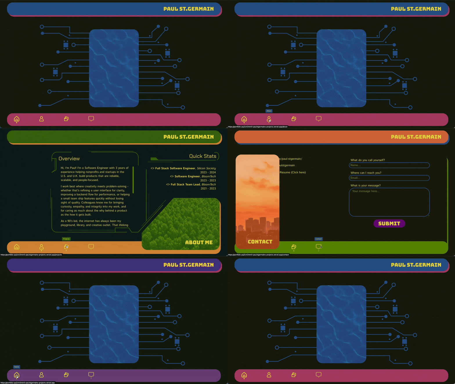 Screenshot of the old design
In my last portfolio design I wanted to aim for something that evoked a sort of 90's cyberpunk vibe while also evoking nature with accent images, color scheme, and a sense of 'flowiness'. I love the design I came up with, and worked hard at it. The accent images and color scheme flowed in transitions from one page to the next, the design reminded me of late 90's/early 2000's message boards, and it was just a joy to look at.
Unfortunately... it was NOT mobile friendly. Truthfully, I had gotten so into the design process that I just hadn't considered that my 90's web cyberpunk portfolio wouldn't work well on mobile, just like many of the legacy old web sites that are still up and running today.
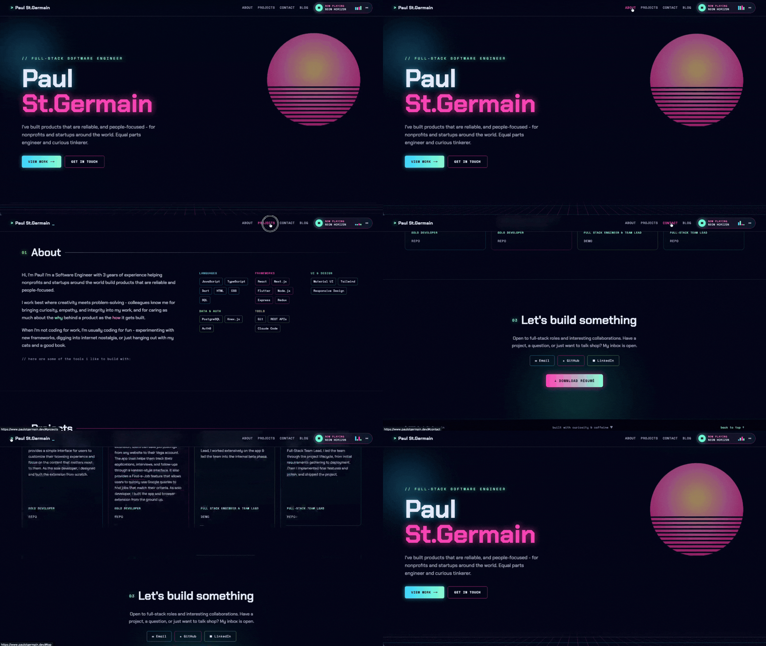 Screenshot of the new design
With my new design, I came in with a different mindset. It should still have personality, but the elements should be modular, each section built in such a way that the elements can easily be shifted to stack on top of each other and read well on mobile.
I'm still a nostalgic soul at heart, but rather than 90's cyberpunk, this time I decided to lean on my love for both code and vaporwave in the design. Vaporwave informed the color scheme, animations, and music player track names (and sound!), while little code artifacts are weaved into the details.
I'm in love with the overall result; my portfolio is part professional document, part slice of the web that feels like home - a place for personal and professional expression all in one!
Animations
The animations here are driven by simple lightweight CSS - no unnecessary animation libraries here (although I am a big fan of GSAP!) All of the animated elements on the site are there to tie in to the retro vaporwave aesthetics I was aiming for, from an old-school looping grid floor animation to a floating vaporwave-style sun, while the blinking terminal cursor elements bring in those little coder-esque details that bring it together as a developer's portfolio. Some of the details I really like here:
The Perspective Grid Floor
One div doing all that work, it's driven by 2 crossed gradients that form a grid that's tilted into 3D with a CSS perspective(...) rotateX(66deg) transform, then faded out with a mask. Meanwhile, a keyframe animation stored in my Tailwind theme, gridmove, scrolls its position so that the grid kind of looks like it's flowing toward you:
// Hero.tsx:
<div
	aria-hidden="true"
	className="absolute bottom-0 left-[-25%] h-[36%] w-[150%] animate-gridmove"
	style={{
		backgroundImage:
		"linear-gradient(color-mix(in srgb, var(--color-cyan) 45%, transparent) 1px, transparent 1px), linear-gradient(90deg, color-mix(in srgb, var(--color-pink) 30%, transparent) 1px, transparent 1px)",
		backgroundSize: "44px 44px",
		transform: "perspective(340px) rotateX(66deg)",
		transformOrigin: "bottom center",
		WebkitMaskImage: "linear-gradient(transparent, #000 70%)",
		maskImage: "linear-gradient(transparent, #000 70%)",
	}}
/>

// globals.css:
@keyframes gridmove {
	from { background-position: 0 0; }
	to { background-position: 0 44px; }
}
Floating Vaporwave Sun - no image necessary
The floating vaporwave sun is just a circle made from a radial gradient with a CSS mask that cuts horizontal lines across it for the classic retro look, which is then animated with a little sunfloat animation:
// Hero.tsx:
<div
	aria-hidden="true"
	className="absolute right-[6%] top-[16%] h-[min(38vw,380px)] w-[min(38vw,380px)] animate-sunfloat rounded-full opacity-55"
	style={{
		background:
		"radial-gradient(circle at 50% 38%, #ffe27a, #ff7ac0 42%, #ff2e97 72%)",
		filter: "drop-shadow(0 0 70px rgba(255,46,151,0.55))",
		WebkitMaskImage:
		"linear-gradient(#000 55%, transparent 55%), repeating-linear-gradient(#000 0 10px, transparent 10px 16px)",
		WebkitMaskComposite: "source-over",
		maskImage:
		"linear-gradient(#000 55%, transparent 55%), repeating-linear-gradient(#000 0 10px, transparent 10px 16px)",
	}}
/>

// globals.css:
@keyframes sunfloat {
	0%, 100% { transform: translateY(0); }
	50% { transform: translateY(-10px); }
}
Drifty, Glowy Background Blob
The blurred, glowing blob in the background of the hero on the main page is there just to add a little character and depth to the top-of-page text, but even it has a subtle animation to add a little more atmosphere:
// Hero.tsx:
<div
	aria-hidden="true"
	className="absolute left-[-6%] top-[8%] h-[360px] w-[360px] animate-blobdrift rounded-full blur-[30px] bg-[radial-gradient(circle,color-mix(in_srgb,var(--color-cyan)_22%,transparent),transparent_70%)]"
/>

// globals.css:
@keyframes blobdrift {
	0%, 100% { transform: translate(0, 0); }
	50% { transform: translate(20px, -24px); }
}
The Little Details
In addition to the more obvious animations, the little things bring the aesthetic together, like elements hovering and generating a backdrop glow when the user hovers over them, the hamburger menu on mobile animating from a classic 3-line hamburger icon to an X when opened, and the small animated bars on the music player.
And for accessibility? All of the animations effectively switch off if a user's operating system asks for reduced motion by using prefers-reduced-motion in the CSS.
Music Player
Originally I was thinking about finding some royalty free music files and playing them through an <audio> tag, controlled through a custom component I'd build out. But I really didn't want the potential bloat that could come with getting indecisive about how many vaporwave/lofi tracks are too many (no such thing in my book.)
So instead, this music player is essentially a mini synth that uses the Web Audio API to synthesize pre-described tracks in real time on the client browser. Each track here is just a set of chords written as MIDI note numbers:
{
	name: "NEON HORIZON",
	bpm: 82,
	cutoff: 1500,
	chords: [
		[60, 64, 67, 71],
		[57, 60, 64, 67],
		[53, 57, 60, 64],
		[55, 59, 62, 65],
	],
	bass: [36, 45, 41, 43],
}
These tracks are then passed through oscillators to produce the notes, gain nodes so they can fade in and out properly, a lowpass filter to remove harsher high frequencies and get that warm, muffled synthwave sound. This all gets passed through a master volume control, and finally to the speakers.
One nice little touch on this thing is the way switching tracks works - when you press the next track button the player actually waits until the current bar finishes playing before switching patterns, so track changes are smooth and remain on-beat.
Since it lives in the navbar, which gets mounted in the website's root layout, it gets rendered exactly once and shared across all of the pages in the site, allowing users to continue to enjoy the music as they explore the site!
Hand-coded Blog Ecosystem
My blog is one of the main elements of my new site that I 100% hand-coded myself. I've always wanted my own professional blog, so I wanted to be sure it was done right and own every part of the process so I could build a whole system that works for me. Plus, it seemed like a fun part of the app to hack away at!
Where posts live and what is in them
Posts are simple .mdx files that live in a flat /posts folder. MDX is, essentially, a markdown format that can also include JSX React components, so I can write simply, but add all kinds of cool enhancements to them like using HTML spans for highlighting text.
Each file starts with a frontmatter block, which is a small chunk of YAML that holds each post's metadata:
---
title: "Designing Vega, the job tracker I wished existed"
description: "A kanban board, a companion extension, and a lot of opinions..."
date: "2026-03-02T12:00:00Z"
tags: ["career"]
---
The post filenames (minus .mdx) become the URL slugs. So what-i-learned-building-my-portfolio.mdx lives at /blog/what-i-learned-building-my-portfolio.
How the data gets processed
The blog post data is handled through a two-pass approach where each file is read twice, by two different tools, each doing a job the other can't. All the magic happens in a single /lib/blog.ts file too, so adjusting blog functionality is kept as simple as can be.
gray-matterreads the raw file text and splits it into two parts: the frontmatter, which is returned as a plain JS object, and the body text itself. This is how the site gets the title, description, and tags. A validation step throws an error if a post is missing a title, description, or date, and the date string gets converted into a real JavaScriptDateobject so we can sort posts by newest and render a human-readable date for each post.@next/mdxworks with.mdxfiles by compiling them into actual React components. This is what turns the Markdown body into rendered HTML on the page, and I'm also usingremark-frontmatterin the configuration for this so the compiler knows to ignore the YAML metadata blocks at the top of each post file (sincegray-matteralready handles that part nicely). So, basically, the split is this:gray-mattergrabs the facts about the post, while@next/mdxturns the writing into something browser-displayable.
This work happens across two main functions:
getPost(slug)does everything we just talked about for one single post and returns its metadata, compiled React component, its slug, and its reading time.getAllPosts()reads the/postsfolder, gets the slug from each filename, and runsgetPoston all of them. It leaves out the compiled component, because this function is only used on the main blog page, which only needs the metadata, and in thegenerateStaticParamsfunction that lists every post's slug (more on that in a bit). I also calculate the average reading time of each post by dividing the total number of words in the base text by an average adult reading time (225 words per minute) rounded up.
How posts look
There's two layers of styling here to make sure posts look the way I want them to, where they would otherwise render more-or-less as plain text:
- The
blog/[slug]/page.tsxfile wraps the rendered post component in an<article>tag that uses the Tailwind Typography plugin (theproseclass), which gives the raw Markdown output sensible spacing and more readable defaults automagically. Otherwise I'd be stuck styling every element by hand just to get readable spacing between paragraphs! - In addition to that, the actual shared theme for all blog posts lives in the
mdx-components.tsxfile, which overrides how individual elements in the compiled blog post component render so they match the site's neon theme: headings get specific sizes, bold text turns neon-pink, links are minty fresh and open in new pages by default, code blocks get a rounded card with a cyan border, horizontal rules get a nice cyan gradient, and so on. This file is a Next.js convention: whatever component mapping you export here is applied to every MDX file automatically.
Tags
Tags are currently just an array in each post's frontmatter (for example tags: ["career"]).
Right now these tags are here for display and color only, as well as letting viewers know generally what a post is about. There's no tag filtering, no per-tag pages, no tag index... but my code is readily extensible so I can add these features as they become relevant!
How BlogCard elements get their colors
In keeping to the retro vaporwave aesthetics, I wanted to implement my color scheme across the blog page's elements too. I was really disinterested in just rendering simple links or same-colored cards - let's see some pizazz in our list pages!
Each post's card element on the main /blog page is rendered from a shared BlogCard component. The accent color is not random - I wanted some consistency across repeated user visits and shared colors for types of articles by tag.
So I implemented a stupid-simple lookup based on each post's first (and primary) tag that looks like this:
export const tagColorLookup: Record<string, TagColor> = {
  "chrome extensions": "cyan",
  career: "pink",
  nostalgia: "lime",
  testing: "gold"
}
So, for each card, I:
- Take the post's first tag (
post.metadata.tags[0]). For example,"career". - Look it up in that table to get a color name, which ties back to my Tailwind theme (
"career"becomes"pink") - Apply that color name in three ways on the card as an inline CSS variable color (
--accent-color: var(--color-pink), for example):- As the faint background gradient and glow shadow on hover
- As the border and hover color
- As the color of the date text and tag chip
Because the same tag always maps to the same color, cards are consistent across every page load. The colors themselves (--color-pink, --color-cyan, and so on) are defined once as theme tokens in app/globals.css. This makes it nice and easy to add new tags and assign colors, especially with my automated blog post publishing skill that I use with Claude Cowork.
Routing
Two routes make up the blog:
- The listing page
app/blog/page.tsxcallsgetAllPosts()and renders aBlogCardfor each. It is a server component, meaning this runs on the server at build time rather than in the visitor's browser. Posts appear in whatever order the folder read returns them; there is no explicit sorting yet. - The individual post page
app/blog/[slug]/page.tsxtakes the slug from the URL, callsgetPost(slug), and renders the compiled MDX component inside the shared page shell, with the same metadata row (accent-colored date, reading time, tag chip) that the card uses. The post pages are statically generated.generateStaticParamslists every slug at build time so each post becomes a pre-built HTML page, anddynamicParams = falsemeans any URL for a post that does not exist returns a 404 rather than trying to build on the fly.
In the end, I'm pretty happy with how the blog has turned out so far, and I have a few improvements and additional features I'm really looking forward to adding over time!
Purely Local Data Handling
Here's the thing: I feel like lots of folks might, when considering implementing a blog, reach pretty quickly for a backend and database setup. The question is: why? These things aren't always a requirement, but lots of people are trained when handling data to go straight to those tools. Granted, if you're handling sensitive user data or proprietary business logic it makes sense to roll a more secure API and data store. But for my use case here? Unnecessary and cumbersome!
.mdx files are super light in terms of storage space, so even if I end up with hundreds of posts here (wouldn't that be cool) it won't increase the size of my codebase by any significant measure. On top of that, handling my files locally and pushing new posts as PRs enables me to make my automated workflow for publishing my articles with Claude Cowork.
In addition to my blog posts, my project info and the skills list in my About section are rendered from simply .json files through shared Next.js components, making adjusting those sections ultra easy. Simplicity is almost always for the best!
How and where I leveraged AI
How
So here's the thing. I'm not pretending to be a master of AI-enhanced development workflows here. I have a LOT more to learn, and honestly, that's surprisingly exciting to me. One of the things that attracted me to this field in the first place besides my love for the internet and dream of building things for it was the idea of never running out of super cool things to learn, and finally I have seen the light with regard to these AI tools to enhance my work!
As an initially extremely cautious adopter, my priority in folding these tools into my workflow has remained the following: I am to retain my ownership of my skills and my work. I'm the developer here, not Claude (or whatever other tool comes along). My usage of these tools should never replace my thinking, my work, my objectives. Secondarily, I set out with the objective of using these tools to not only enhance my work, but enable deeper learning for myself on the job.
So here's the components of my current workflow as I used it on this project:
- Developer in the seat: When working with this tooling it's my opinion that the intentional developer should be in the seat observing and guiding the work piece-by-piece. This limits instances of some of the more creative LLM hallucinations not being caught, allows the developer to more effectively use the tools at their discretion (like swapping between Plan Mode, implementing skills, knowing when and where to trigger subagents, MCPs, etc. as needs arise to both conserve tokens and get the best use out of each of these features).
- Plan, plan, plan: My god, do I love Plan Mode. Being able to drop a wall of technical and otherwise requirements for a feature and iterate over a plan of action before ever implementing is one of the coolest things besides skills that I've seen CC able to do. For my own workflow, I develop the plan first - make the technical decisions, bring any relevant design mockups, talk through my intent and requirements - then pass it off to CC to iterate over and watch for anything I miss. If I missed anything that the tool can highlight? Great - I can add that to my list of things to learn on my own time outside the project!
- Skills to pay the bills: Skills are shockingly powerful little things for what amount to Markdown files! For this project in particular, I used the
/skill-creatorskill to create a/code-reviewskill (meta) for use on any of my own handwritten and untracked changes to the codebase. This allows me to remain the actual developer I want to be while ensuring any edge cases I might miss get caught before anything gets pushed to main.
Where
So, where in this project did I leverage AI tooling? Let's walk through it:
- Design: Knowing that Anthropic had released Claude Design, I was curious to try that out too. So I crafted my initial design in Figma, exported every relevant piece of it, and wrote a lengthy writeup of the intent behind my design. What I was going for, my aesthetic preferences, everything. After a few passes, Design passed back a fully realized (if basic) version of my wireframes, visual mockups, and chosen color scheme for the main page and main blog page.
- Import: Using Design's 'pass to Claude Code' option enabled me to bring my design directly into my IDE by running a simple command in VS Code's integrated terminal - keeping myself in the loop, I watched and accepted each step as CC implemented my full accepted design as plain HTML/CSS/JavaScript. A perfect base for me to build upon!
- Refactor: Could I have transitioned the codebase into a Next.js + TypeScript + Tailwind project myself? Absolutely. But I wanted to move onto the fun stuff quickly, and moreover I wanted to see what these tools were capable of. So, using CC's Plan Mode (my favorite mode), I gave it all of my technical requirements and limitations for it to follow. No changing the look or functionality of any of the elements, only translate it directly into a Next.js project using my specified dependencies.
- Fix: There were a handful of issues remaining after the mostly-successful pivot to Next.js, which I went through and fixed myself. Incorrectly applied CSS from my Tailwind theme on certain elements, broken links that didn't translate, misalignment of navbar elements, duplicated navbar and footer for subtle changes across main and blog pages - I fixed all of this myself.
- Learn: I didn't know much about making a music player of the sort I have in this project before working on this, but by watching what CC did to implement that feature and reviewing the code as it worked I learned a lot and now have a solid base on which to learn more. I'm looking forward to adding more tracks in the future!
Outro
So is AI going to become sentient, don a tie, go into the office, and take our jobs? No, I really don't think so. Nor do I think you're going to be "left behind" if you don't immediately adapt to using these tools, as knowing the fundamentals and how to actually code is still much more important. These tools still require human hands, creativity, and learned experience to produce meaningful, effective, developer-intent-matching code.
However, like the compiler, jQuery, frameworks and the like before it, it is absolutely an incredibly valuable (and learnable!) tool in any developer's toolkit that can be leveraged to enhance our work and ability to learn - and it can be used without losing your own capabilities to it if used with intentionality, curiosity, and the right workflows.
I'm sure I'll have more to share on the subject as I learn more and polish my own workflows, but for now I'm happy to have finally gotten to a place where I can approach these tools with the kind of level-headedness they require and open the door to the opportunities they represent. It's an exciting time to be a developer!